If you’re looking for examples of pillar pages, you’re most likely thinking of creating a pillar page of your own, and adopting a topic-cluster strategy as a means to improve your inbound, content marketing, SEO and lead generation efforts.
I did the heavy-lifting for you and have aimed to create the largest library of pillar page examples on the web. With each example, I share what makes them effective, as well as what I might do differently if we were to recreate them from scratch.
But before we dive in, let’s start with a definition:
What is a Pillar Page?
A Pillar Page is an authoritative, long-form piece of content on your website that addresses a topic comprehensively in an organized, logical way. It acts as a strategic cornerstone for other content on your website that may address subtopics in a more granular fashion.
Pillar pages are often linked to prominently on a website, contain secondary navigation allowing users to jump-ahead to subsections, and may include a form where readers can download a PDF version of the on-page content. Pillar pages tend to link to related blog posts, creating “topic clusters” that help readers explore sub-topics in more depth. These links also help search engines like Google understand the semantic relationship between different pages on a website, often leading to higher rankings in search results.
Conceptually, it makes perfect sense. Create a long-form piece of content that acts as a “the authority” on your topic of choice, and you’ll rank like crazy. But building one from scratch is easier said than done.
Take the Guesswork out of Inbound
Receive a detailed Inbound Marketing Strategy in 30 days or less.

Looking at the examples of others is an easy way to trigger ideas and start to shape the criteria of what an effective pillar page should look like.
So let’s take a look.
Examples of 10x Pillar Pages
Pillar pages can take many different forms, but a great place to start is to create content that is closely aligned to your organization’s core value proposition or mission and is ten times better than any other similar content on the web. Your company will only have 2-3 pillars like this, so you can invest a little more time, effort and energy to create content that really stands out. Below are several examples of pillar pages that fit this type.
GoodUI Evidence
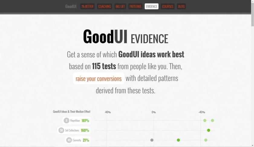
GoodUI is a project that shares the results of tests and experiments designed to increase conversions by providing a better user experience.
This resource promises to help you “Get a sense of which GoodUI ideas work best based on 115 tests from people like you. Then, raise your conversions with detailed patterns derived from these tests.”
What makes it a great pillar: The team at GoodUI created a single page to aggregate all (or at least many) of the test results contained on their website in a single page, displayed in a very intuitive, logical order. It’s beautifully designed, fun to use, and a unique asset on the web. It’s likely to acquire many links over time.
What might make it better: The page would benefit by adding a meta description and keyword-rich title tag. The team could also capture more leads by offering a PDF download containing all of the test ideas contained on the page.
Metrics:
- Page Authority: 42
- Linking Root Domains: 7
- Total Shares: 1,612
Matthew Barby’s Customer Acquisition Strategies
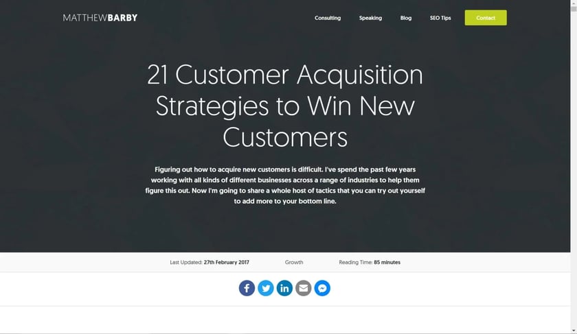
Matthew Barby is a Digital Marketing Consultant and HubSpot’s Director of Acquisition. He is the brains behind HubSpot’s own adoption of a topic cluster and pillar page strategy and has seen massive results in implementing the strategies he evangelizes.
This resource contains many (really good) tips, tactics, and strategies for improving your customer acquisition tactics.
What makes it a great pillar: The tips contained here are some of the best ones I’ve come across. There’s at least one idea that every business could run with and see impressive results. The top of the page claims it is an 85-minute read. That would be time well spent. This resource also ranks phenomenally well, ranking #1 for its’ targeted term. The “Last Updated” tag is smart because it tells the user that these tactics are being maintained and regularly updated, so you know this isn’t just a list of ideas are current and still work today.
What might make it better: A quick jump menu might make it easier to navigate. It might also spark the user’s interest more by giving a preview of the content that follows lower on the page. He does this on his SEO Tips page, and the anchor links are already there in the code, so I’m sure it’s already in the plans.
Metrics:
- Page Authority: 43
- Linking Root Domains: 18
- Total Shares: 2027
Typeform’s Customer Success Guide

Typeform is a SaaS company that offers interactive forms that marketers and small businesses can use to make their forms a “little more human.” These forms make for excellent customer feedback tool used to improve customer success, retention, and happiness. For this reason, a comprehensive guide on customer success makes perfect strategic sense for a pillar page.
What makes it a great pillar: Read this guide and you’ll find an excellent primer on customer success. The team at Typeform took extra care to create a beautifully designed resource that fits in well with the rest of their website and brand. The top of the pillar features a button-style jump-ahead menu, and as you scroll a sticky menu allows you to easily navigate back to the top or ahead. Calls-to-action inviting you to try their templates are scattered throughout the guide, increasing the chances of capturing leads and customers from the traffic this page earns.
What might make it better: While this guide is pretty well optimized for search engines overall, I noticed it was missing a meta description. Meta descriptions don’t directly impact rankings, they do help entice searchers to click through to a page when it appears in search results. The page also has a lot of text, so it would be really nice to be able to download a copy of the guide that I could revisit later.
Metrics:
- Page Authority: 47
- Linking Root Domains:
- Total Shares: 1,645
HubSpot’s Instagram Marketing Guide
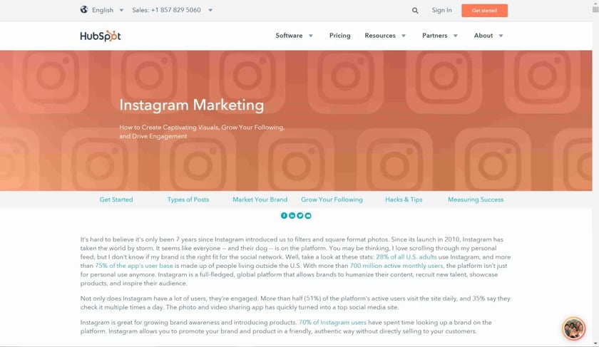
HubSpot has one of the most heavily visited blogs in the world and has become known for just about all things marketing. Therefore it makes perfect sense that they would be ranking #1 with a guide on Instagram marketing.
What makes it a great pillar: Leave it to HubSpot to create a nearly perfect pillar page. They do just about everything right here. From the jump-ahead navigation that allows you to skip to the sub-section that interests you most, to the highly tactical content, to the excellent visual aids, this is a great resource. This a great example of topic clusters in action as well. The guide links to related blog posts and those blog posts all link back to the guide using the anchor text “Instagram Marketing.” The list of related articles towards the bottom of the pillar makes for a nice finishing touch.
What might make it better: Although this page contains CTAs to several downloadable content offers that are relevant to the core topic, I still think it would be nice to get a PDF copy of the guide. This is a lot of content to read through in one sitting. A PDF version would be handy.
Metrics:
- Page Authority: 57
- Linking Root Domains: 9
- Total Shares: 33
SaaS DNA Project’s Anatomy of a SaaS Marketing Site
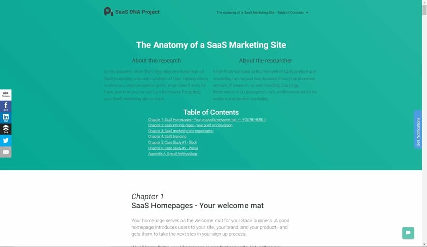
The Saas DNA project offers community-driven SaaS research, education, and data for the low, low price of free. This resource, The Anatomy of a SaaS Marketing Site is Hiten Shah’s product marketing strategy, which he developed through decades of launching startups like Crazy Egg, Kissmetrics, and Quicksprout.
What makes it a great pillar: This page genuinely sparked my interest. It feels like I’m sifting through takeaways from years worth of research without having to do the research myself. The page features a helpful table of contents, an easy to navigate layout, and a sticky CTA that allows me to download a PDF version for convenience.
What might make it better: The URL of the page looks like it still reflects the working copy of the page: /hiten-shah-saas-marketing-product-strategy/. This might just be a gamble that the team made, assuming the author’s reputation might carry more weight than the substance of the content, but I would personally change it to something like /anatomy-saas-marketing-site/ for better SEO results. The content is also dispersed across multiple URLs, limiting the impact of the piece as a whole. To help search engines better understand the relationship between this content, they might choose to implement the rel=”next” and rel=”prev” tags on each section.
Metrics:
- Page Authority: 45
- Linking Root Domains: 12
- Total Shares: 509
HelpScout’s Acquiring Customers with Email
HelpScout offers customer service software that’s often used as a help desk or shared inbox by customer service and customer success teams. They teamed up with AWeber, an email marketing service provider, to provide this helpful resource on building lists for your email marketing efforts.
What makes it a great pillar: This page is done perfectly. The content is truly useful, the design is easy on the eyes, and the page is easy to navigate. It’s optimized well for search engines and at the time of me writing this article, was ranked #3 for its targeted term, list building. The page includes a welcome-mat CTA prompting you to download a PDF version, which is a convenient feature to the reader and a great way for Help Scout to capture leads from the page.
What might make it better: I noticed the page didn’t really link to any of Help Scout’s blog articles, and that there weren’t many links from within the helpscout.com domain pointing to the page. If Help Scout was to create a topic cluster around list building, linking to this resource from any article focused on email marketing or list building, and then also link to those resources from the pillar page itself, it might get the boost it needs to move this page from its current rank of #3 to #1.
Metrics:
- Page Authority: 64
- Linking Root Domains: 54
- Total Shares: 304
Gather Content’s Project Guide to UX Design And Content Strategy
One of the top reasons website redesign projects run late and go bad is the difficulty in writing, editing, organizing and approving content. Gather Content comes to the rescue by helping teams organize, structure, produce, manage and migrate website content. This resource is designed to help UX design professionals plan for the content hurdle.
What makes it a great pillar: I’ve always been a big fan of Gather Content’s guides and resources. In fact, their website is one of the first places I noticed pillar pages at work. For years they have been offering their in-depth guides directly on their website, without a gate, while still offering a PDF version. This pillar features all of the common characteristics of an effective pillar page: great content, jump-ahead navigation, and all information displayed directly on the page.
What might make it better: Better interlinking between the guide and related blog content on Gather Content’s website might improve the visibility of both the pillar page and each supporting blog post.
Metrics:
- Page Authority: 50
- Linking Root Domains: 18
- Total Shares: 291
The Atlantic’s Population Health
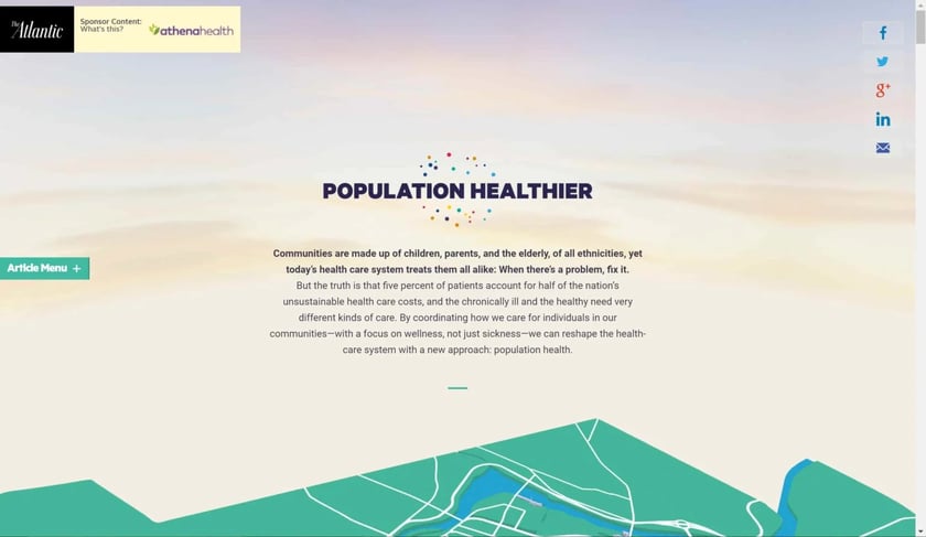
Population Healthier is a piece of sponsored content created by athenahealth and placed on The Atlantic. While it is a better example of sponsored content than it is a Pillar Page, it was featured on other round-ups so I felt it would be interesting to include here.
What makes it a great pillar: Again, I’m not sure this actually qualifies as a Pillar, but it does have some similar attributes. This is a beautifully designed, interactive article that may do a great job at acquiring links over time.
What might make it better: When we think of Pillar Pages, we usually think of resources that are designed to rank really well in search engines. This strategy helps a brand gain visibility for a highly competitive term, and to become associated in their buyer’s mind with the topic. Since athenahealth paid to have this page placed on The Atlantic, it is unlikely to rank well organically—but that wasn’t necessarily the goal of the team that created this. Sponsoring content on a third-party site can be a great way to tap into someone else’s audience, which was likely the primary goal behind this piece. Once this campaign has run its course, the team behind it should consider placing it on their own domain where it can easily become a true pillar page.
Metrics:
- Page Authority: 51
- Linking Root Domains: 4
- Total Shares: 1,018
HubSpot’s Battle of the Bots

In September of 2017, HubSpot acquired an artificial intelligence bot builder called Motion AI. To help promote this acquisition and begin building demand amongst their customer base and the marketing industry as a whole, they released a creative marketing “story” called Battle of the Bots. While it carries many characteristics of a pillar page, it’s a bit more geared for generating social shares than it is ranking well in search results. Perhaps this is why HubSpot also created another asset called Robot Revolution, which is a bit more in line with what a typical pillar page might look like, and has more links and authority than Battle of the Bots does.
What makes these great pillars: Battle of the Bots takes a boring, complex set of topics—bots, artificial intelligence, and machine learning—and turns them into a fun, easy to understand story. Pillar or not, this is a great piece of marketing collateral. Robot Revolution follows all of the best practices of a pillar page and is an excellent example of how to structure one. Both pages present frameworks and core concepts in the form of graphics rather than text, which are likely to help the pages acquire links as other marketers use those graphics and link back to the page to give credit.
What might make them better: More blog content explaining the application of artificial intelligence and bots in marketing that links to these pillars will strengthen their reach and authority. I have no doubt that HubSpot is already working on this as they continue to build in artificial intelligence into their platform.
Metrics:
- Page Authority: 58
- Linking Root Domains: 9
- Total Shares: 1,982
Turning inspiration into action
Hopefully, these examples have helped to illustrate what a pillar page should and shouldn’t look like. If you have taken the time to closely look at each one, you’ll notice there are several common characteristics that make a pillar page successful, as well as several mistakes that marketers often make.
Many of these examples were created by large organizations with deep pockets and plenty of resources to create pillar content that that is truly epic and wow-worthy. But don’t let their success discourage you. You don’t need to out-do these examples to be successful. You just need to create something that is the best resource on the web for your customers and your industry.
You may have also noticed that many of these examples were created by marketing companies marketing to other marketers. Few other industries have adopted pillar pages or topic clusters as aggressively as the marketing and tech space has, so if you’re in another industry, you likely still have a chance to become the early adopter and be the one who sets the bar for your space.
Create content that helps your buyers better understand a major topic that’s central to their purchase decision, and you’ll likely be successful even without all the bells and whistles that these examples offer.
Have an example of a pillar page that should be included on this list? Share a link in the comments below and we’ll take a look!